The Brand Identity Blueprint: How to Build a Brand That Works Without You
Many remote workers and founders think about brand identity the wrong way around. They spend hours agonizing over logo colors and font choices before they’ve answered a much more fundamental question: what impression do I actually want to leave?
Brand isn't what you put on your website. It's what someone thinks about you after they've left it.
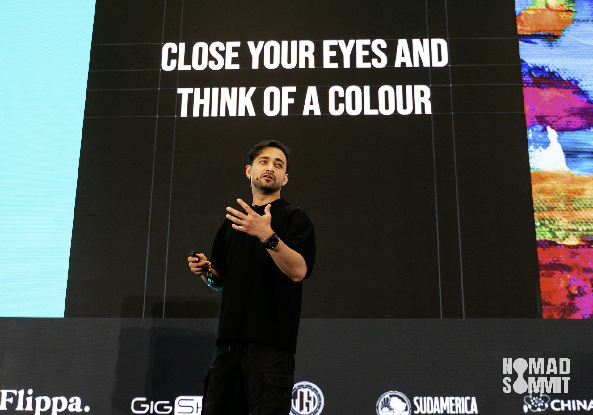
Nivit Kochhar, founder of the design agency Supercharged, laid out a systematic approach to brand identity at Nomad Summit in Chiang Mai — one built around psychology, not aesthetics. Her argument: remote workers, more than almost any other professional group, live and die by first impressions. Every touchpoint is digital. There's no handshake, no office walk-through, no in-person charm to fall back on. Which makes a strong, intentional brand identity not a nice-to-have, but infrastructure.
Brand, Brand Identity, and Branding Are Not the Same Thing
The confusion starts here, and it matters.
Brand is the perception that other people hold of you — your product, your service, your business, or your personal presence. You don't control it directly. You influence it.
Brand identity is everything you do have control over. Your logo, your color palette, your fonts, your tone of voice, the way you show up visually across platforms.
Branding is the ongoing work of closing the gap between those two things — constantly aligning what you put out with how you want to be perceived.
For remote workers specifically, Kochhar makes the case bluntly: if your brand identity is weak, you make every salesperson's and marketer's job ten times harder. If it's strong and consistent, you make it ten times easier. The brand does work on your behalf before you ever get on a call.
And the bar, honestly, isn't as high as most people assume. Anything intentional beats the defaults.
Start With Positioning Before You Touch Design
At the base of Kochhar's brand identity framework sits positioning — and she's specific about what that means: what are you building, who are you building it for, and why does it matter to them?
Airbnb is the example she uses, partly because it's so clean. They're a community-driven marketplace for unique stays, built for travelers who want something beyond standard hotel tourism, designed around the idea that you should feel at home anywhere in the world. That's a complete positioning statement. Every visual and verbal decision they've made since flows from it.
The remote business version works the same way. A social media agency isn't just "a social media agency." Position it as a creative multimedia partner for health and fitness brands on Instagram, focused on authentic community engagement. Now you have something to build a brand around. The niche gives you direction. The direction gives you design decisions.
Without positioning, brand identity becomes decoration. With it, every choice has a reason.
Brand Personality: If Your Brand Walked Into a Room
Once positioning is clear, Kochhar moves to personality — and the framing she uses is worth stealing.
If your brand were a person and walked through the doors of an event, who would they be? How would they make the room feel?
She breaks it down into three dimensions: persona, presence, and promise.
Persona is about archetype. Is your brand the wise mentor? The irreverent younger sibling? The main character? The anti-hero? These aren't just metaphors — they become guardrails for every piece of copy, every design choice, every interaction.
Presence is about feeling. Would your brand make people feel energized? Calm? Supported? Challenged? This is the emotional residue your brand leaves behind.
And promise is the one thing your brand would never compromise on. This is where values live — not abstract mission statement values, but the specific commitments your brand makes to its audience through how it shows up.
People don't bond with products. They bond with personalities. That's the mechanism underneath all of this.
Color Does More Work Than Most People Realize
Consistent use of color can increase brand recognition by up to 80%. Kochhar doesn't present this as a marketing statistic — she demonstrates it.
A metallic red can. No logo visible. Everyone in the room knows it's Coca-Cola. That's color doing the identification work entirely on its own. Flip it to blue and the same mechanism works for Pepsi. The color is the brand signal.
Color triggers emotion more reliably than words do. Blue communicates trust and stability, which is why 70% of multinational corporations use it. Red is intense and urgent — fast food chains use it deliberately because it activates appetite. Yellow and orange read as communal and energetic. Green signals wellness and nature. Purple carries associations of wisdom and status. Black is sleek and luxurious. White is clean and intentional.
For building a practical color palette, Kochhar recommends three to five colors, structured with purpose. Sixty percent of the time, you lead with your primary color — this is your brand's dominant visual identity. Thirty percent goes to secondary colors, which add flexibility and personality. Ten percent is reserved for accent colors: high-contrast, attention-grabbing, used for calls to action or key highlights.
One dimension most people skip: shades. Building out light and dark variations of your palette creates depth, enables motion design, and — importantly — improves accessibility. Around 100 million people worldwide have some form of visual impairment. If your brand can't be read, it effectively doesn't exist for a significant slice of the population.
Fonts Tell a Story Before Anyone Reads the Words
A Comic Sans logo in a lawyer's office. It's an extreme example, but it makes the point clearly: the font choice communicates something before the content does.
Kochhar divides typography into four categories. Serif fonts — the ones with the small decorative strokes — carry authority and tradition. She describes them as "people in three-piece suits with a hat on," which is a useful mental image. Sans-serif fonts are clean, minimal, modern. Script adds handwritten warmth and a human quality. Decorative fonts are expressive and bold, best used sparingly.
For most brands, the simplest approach is one versatile font family with enough weight variation to create visual hierarchy — ultra-thin for subheads, extra-bold for headers, regular for body text. Fonts like Poppins, Helvetica, or Proxima Nova work well for this.
The alternative is pairing two fonts: an expressive serif for headers and a clean sans-serif for body copy. This creates contrast and flexibility without visual chaos.
A third option, borrowing from the 60-30-10 rule: add an accent font used occasionally for moments that need a bit more personality. But sparingly. Fonts are like seasoning — more isn't better.
The Logo Is the Icon, Not the Brand
This is the misunderstanding Kochhar encounters most often. People conflate logo with brand. The logo is the stamp — the most compressed symbol of everything the brand represents. But it's the tip of the pyramid, not the foundation.
When evaluating a logo, she uses three criteria. Is it simple? A good logo works in black and white, uses no more than three colors, and relies on a single icon. If the logo only holds together because of color, it's not doing its job. Is it memorable? Someone shown the logo for ten seconds should be able to roughly sketch it from memory. Is it adaptable? It needs to work at favicon scale and billboard scale equally well.
And here's the part that surprises most people: a logo doesn't need to have meaning. Meaning is built over time.
Nike's swoosh didn't mean excellence in 1971. It means excellence now because of everything the brand has done since. Apple is a fruit. MailChimp is a chimp. Neither connection makes rational sense, but both brands built strong, recognizable identities around them anyway. The goal is memorability, not symbolism.
Don't make the logo carry too many ideas. One clear concept, executed well, is always stronger than two ideas fighting for attention.
The Logo Design System
A logo isn't one thing — it's a system of variations that adapt to context.
A full lockup with icon and wordmark. A horizontal version for navigation bars. A slim version for letterheads. A standalone icon for app icons and favicons. A standalone wordmark. An emblem version for bold, large-format use. Each version serves a different environment while staying consistent in identity.
Most people design one logo and then try to force it into every context. Building a small system up front saves significant effort later and keeps the brand looking intentional across all its appearances.
Where Brand Identity Gets Implemented
Once the identity is in place — positioning, personality, color, typography, logo — it needs a home across every relevant digital touchpoint. Website, social media, advertising, email. And if the business involves physical products: packaging, print, merchandise.
But there's a less obvious implementation moment that matters significantly for remote teams: when the brand is handed off to collaborators. The moment someone else starts speaking in your brand's name — a contractor, a team member, a design partner — they need a shared language to work from. A clear brand identity makes that handoff possible without losing consistency.
Kochhar's guidance on flexibility is worth noting. Follow the brand guidelines 80% of the time. The other 20% is room for the brand to experiment, tap into trends, and stay current. The goal isn't rigid compliance — it's recognition. The goal is impression, not perfection. Connection, not perfection.
Nomadic Life as a Creative Resource
One of the more interesting ideas in the talk isn't a framework — it's a reframe of what remote workers and digital nomads already have access to that most brand designers don't.
Morocco's deep indigo and rustic texture. Vietnam's lush primary green with accents of red and yellow. Portugal's dark ocean blue anchored by an instantly recognizable orange. These aren't just aesthetics to admire — they're palettes, patterns, and design languages built up over centuries of cultural expression.
Kochhar showed brand identities directly inspired by Portuguese rooftops, Panamanian rainforests, and Uzbek architectural patterns. The inspiration was specific, not vague — drawn from actual visual environments, translated into design systems.
It's a different way of thinking about what the nomadic lifestyle makes possible. The world you move through is a design library. Most people don't use it that way.
The Practical Starting Point
Kochhar's closing instruction echoes her opening exercise — the visualization. Before you open a design tool, close your eyes. Imagine your brand as a fully realized thing. Feel it. Then build toward that.
It sounds abstract. But the underlying point is concrete: brand identity decisions made from a clear, felt sense of what the brand should be are almost always better than decisions made by scrolling through templates and picking what looks nice.
The brands that become recognizable over time aren't necessarily the ones with the biggest budgets or the most refined aesthetics. They're the ones that committed to a direction and stayed consistent long enough for the identity to accrue meaning.
That's available to anyone willing to be intentional about it — including, maybe especially, those of us working without a physical office, a sign on the door, or an in-person first impression to rely on.
Sources & References
- Supercharged — Nivit Kochhar's design agency specializing in brand, website, and app design
- Nomad Wildheart — Nivit Kochhar's personal fashion brand
- Airbnb — Community-driven marketplace for unique travel stays, referenced as a positioning example
- Mailchimp — Email marketing platform, referenced as a brand personality example
- Pinterest — Referenced as a resource for discovering logo typefaces on a budget